I wanted to write a quick post pointing out something that I don’t think has been widely appreciated about the covid19 R value now familiar to everyone. You have probably seen a version of the graphic showing how one infected person leads to an exponentially growing number of cases if tranmission is not stopped. Something like this,
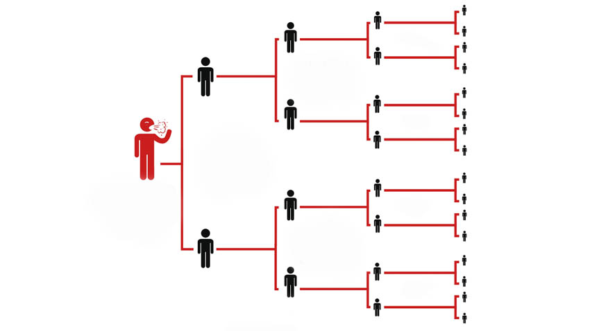
These kind of images give an excellent idea of the idea behind exponential spread. But they are obviously not an accurate picture of the real world. Every infected person does not infect exactly 2 others, if that were the case then R could only by an integer. Instead some people infect 0, some 1, some 2, etc. and R tells us what the average number of infections is. If you’re like me, you probably had a picture something like this in your head.
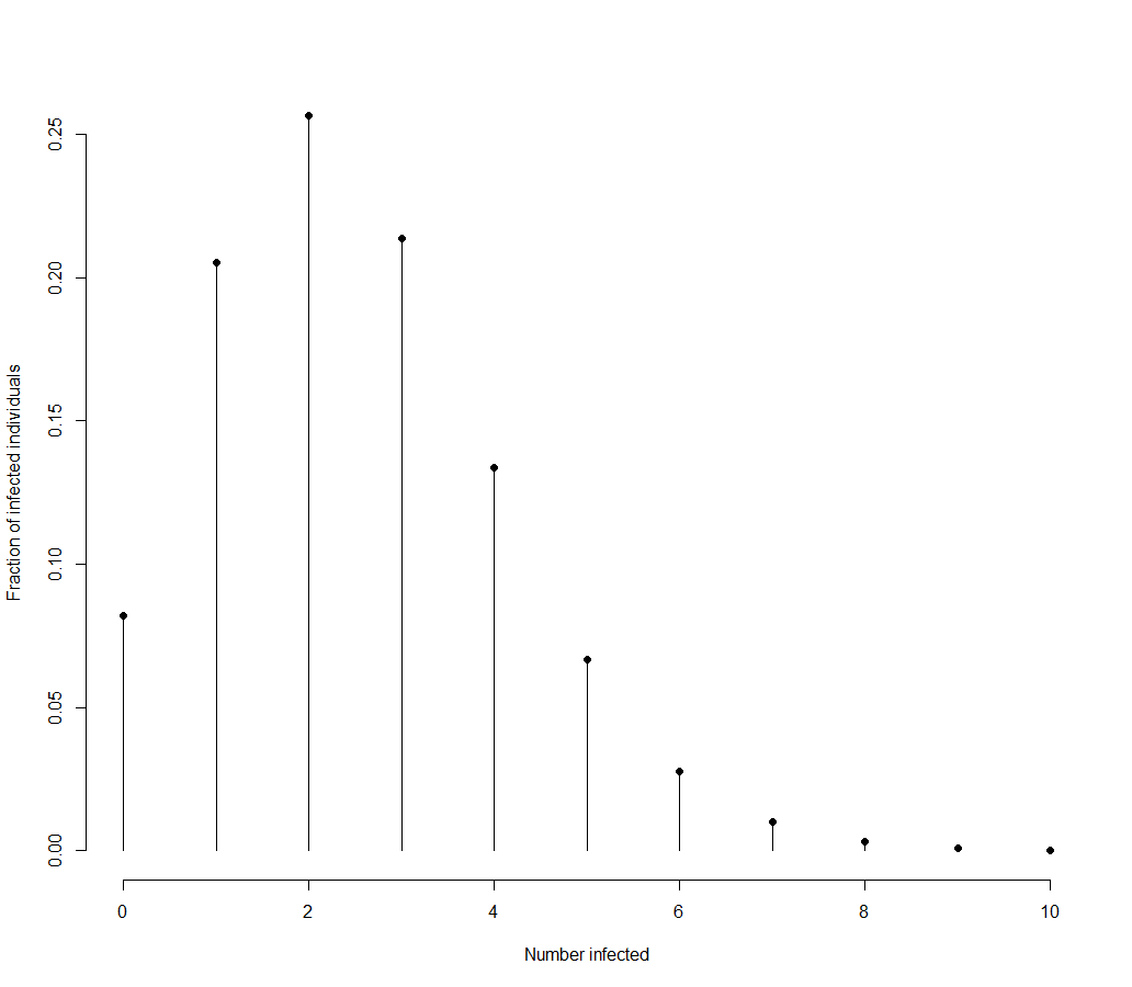
This plot is made using R of 2.5. It shows most people infecting 2 others, a fair number infecting 0, 1, 3, 4, or 5, then a quick drop off from there. This is the intuitive choice as most of us are used to thinking about the bell curve of the normal distribution. In fact, the above distribution (a Poisson distribution), is the only reasonable distribution to choose when you know that observations are discrete (an infected person can only infect 1 or 2 others, not 1.5) and you only know its mean (the R value). This is because the Poisson distribution is described by just one parameter, usually represented by $\lambda$ which is the mean of the distribution.
But the true distribution for covid19 infections may not look like this simple Poisson distribution with a peak near the mean. The real distribution need not follow a neat mathematical formulation, but we can approximate it with a widely used extension to the Poisson distribution, the negative binomial distribution. There are many ways to parametrise this distribution, but the one I find the most useful is to parametrise it in terms of its mean $\lambda$ and an over dispersion $\phi$. The Poisson distribution has the property that it’s variance equals its mean,
\[\sigma^2 = \lambda\]the negative binomial has the variance greater than its mean, in the following way
\[\sigma^2 = \lambda + \phi \lambda^2\]For this reason, we often say that the negative binomial distribution is an “over-dispersed” Poisson distribution with the amount of over-dispersion controlled by $\phi$. Notice that when $\phi=0$ the two distributions are identical.
The real distribution for covid19
I knew this, but still had in my head the expectation that the covid19 infection distribution would be basically Poisson, with some amount of over dispersion. So I was shocked to discover that the evidence indicates that around 20% of cases create 80% of transmission. If R is 2.5, this translates into a negative binomial distribution with roughly $\phi = 4$. I’m pretty sure you could calculate an exact formula for what $\phi$ should be given x% of the cases contributing y% of the transmission, but I was lazy and just changed $\phi$ until it was in the right ball-park.
Anyway, so what does the distribution of infections look like for covid19? If we take the above approximation, R as 2.5, $\phi$ as $4$ we get,
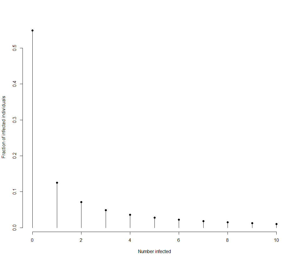
which looks absolutely nothing like what I’d expected. This distribution still has mean of 2.5. But instead of having a peak at 2 or 3, the majority of people infect no one and there is a long tail of people who infect lots of people.
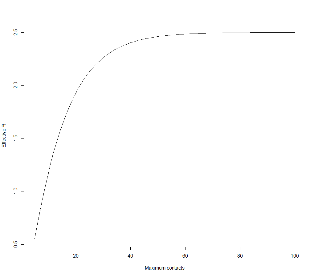
Other than being counter-intuitive, that covid19 has this distribution is actually a potentially good thing for controlling infections. Because most of the infections come from those that spread it to lots of others, if you can limit the number of people any one person can infect (by say limiting the number of contacts everyone has), you can dramatically change R. For example, if you make it so that no one can infect more than 10 others, R drops from 2.5 to 1.2. If the distribution were Poisson, the same intervention would change R from 2.5 to 2.497.
Consequences
Here is how R changes from 2.5 if you can cap the number of infections for the distribution with $\phi=4$.
This provides a potential explanation for why the virus doesn’t “take hold” in all places it is detected. If most people spread the virus to no one, if you only import one or two cases, the most likely outcome is those people infect no one and the chain of transmission ends. Which may explain how there could have been positive cases earlier than expected; those were real cases, they just didn’t go any further.
In the light of this it’s also not surprising that cases are highest in the places where lots of people have to be in the same space: hospitals, care homes, schools (?).
While I was very surprised by how extreme the distribution of infects is, it does make a lot of sense. I also find it very encouraging that we may be able to keep infections from getting out of control again just be limiting large and medium sized gatherings of people.