Having had a lot of mathematical training, I’ve tried to draw comfort in this pandemic from using that training to understand what is going on in generalities. I’ve really done this for my own gratification, but I am writing up a collection of semi-related thoughts using very high level mathematical thinking about COVID19 in case it’s of use to anyone else.
First a disclaimer. I highly doubt enough people will read this for a disclaimer to be necessary, but just in case. I am not an epidemiologist or a virologist. I’m just some guy with too much mathematical training playing around with some basic equations to get a rough understanding of things and give myself a fleeting sense of control. I have made every attempt to stick just to the simplest formulation of the problem I can think of and only draw conclusions that depend on basic properties of exponentials and not the details.
All about exponentials
So here’s my simplistic model. Assume that an outbreak starts with $N_0$ infected people and each infected person infects $R$ others in time $\Delta$. That’s it. From this it follows that after time $\Delta$ there will be $N_0R$ new infections, after time $2\Delta$, there will be $N_0R^2$, etc. So the number of new cases $N(t)$ at time $t$ will be
\[N(t) = N_0 R^{\frac{t}{\Delta}} = N_0 e^{\frac{t}{\Delta}\log(R)}\]where I’ve changed to base $e$ to make working with it easier. Obviously (as previously stated) this is a very simplistic model. But if we had very good information about how things spread, it would probably work pretty well for the close to unconstrained growth, phase. The difficulty is of course that the parameters $N_0$, $R$, and $\Delta$ are not well constrained. So if this is to be useful at teaching us anything, we have to remember that each parameter could be very different from what we expect.
Exponentials have strange properties
One of the weird things about exponentials is that their derivatives have the same shape. In fact, this property can be used to define an exponential function. One consequence of this is that the answer to many sensible questions we can ask will have an answer with the same “shape”. That is, it will depend on whatever the parameter is in the same way as $N(t)$ does on $t$. For example,
- How much does the number of new cases increase in time $t_d$ is proportional to $ e^{\frac{t_d}{\Delta}\log(R)}$
- What about total cases, that’s proportional to $e^{\frac{t_d}{\Delta}\log(R)}$ plus some constant
- How quickly does the number of new cases change with time? $ \sim e^{\frac{t_d}{\Delta}\log(R)}$
Each of these will have a different constant of proportionality, which will matter very much if you care about the exact numbers. But the shape will be the same in all cases where you’re integrating, differentiating, or doing many other operations on $N(t)$.
Of course all the effort put into social distancing, lock downs, and testing and tracing is about making $R$ change with time, which breaks these properties as $R$ becomes $R(t)$. Nevertheless, we can still observe a few basic things that will be true no matter what.
Locking down a week or two earlier really, really helps.
This has been covered to death. The way I find it most intuitive to think about is that if we calculate the fraction of total cases that are infected in the last $t_w$ weeks we find that this is given by,
\[1-e^{\frac{t_w}{\Delta}\log(R)}\]so if we assume $R=2.5$ (which seems as good a value as any for the initial outbreak) and $\Delta$ of 1 week, we get that 84% of the total cases (at the point lock down starts) are accumulated in the last two weeks and 60% in the last week. Yikes!
It’s exponential on the way back down too
If locking down is effective than it changes the value of $R$ to something that is less than $1$. That is, each person on average infects fewer than one person and so the number of new cases declines. What this means is that the same equation (with a different value of $R$) can explain what happens starting from the point of lock down, just as well as it did the initial growth.
This is great news, because it means that the decrease in cases is also exponential (starting from when lock down starts). Because it’s also exponential on the way down, we can apply the same logic to the number of cases removed. So most of the cases post lock down occur in the first “time period”.
I very deliberately said “time period” and not week, because although the curve is exponential on the way down too, it will have a different doubling/halving (the things that multiply $t$). Precisely, our exponential will double (or halve) every,
\[\log_2(e) \frac{\log(R)}{\Delta}\]units of time. The way I’d usually think of it is in “e-folding times”, which is the time it takes to decrease/increase by a factor of $e$, which occurs every $\log(R)/\Delta$.
The important thing to note is that this period of time depends on $\log(R)$. For $R=2.5$ on the way up $\log(R) \approx 1$, but on the way down it’s unlikely that $R=1/2.5$ (which would make $\log(R) \approx -1$). The exact value is hard to calculate, but values from $0.5$ at the very optimistic to just below $1$ at the worst seem to be the plausible range at the moment, depending on the details of the lock down. Which brings us too…
It takes longer to go back down..
I’ve seen pictures of projected peaks, which very often look symmetric. Unfortunately, in order to end up with a symmetric curve the value of $R$ on the way down needs to have a very precise relationship to the value of $R$ on the way up. Which seems very unlikely to me (see above). Put another way, do you really expect the virus to be the same amount of suppressed after lock down as it was infectious before lock down? We can make a very dumb extension to the model and assume that $R=R_+$ up until lockdown at time $t_L$, then $R=R_-$ from that time onwards. We can stick this into an R function and make a plot of what this would look like
N = function(t,tLock=3,Rup=2.5,Rdown=.7,N0=100,delta=1){
  N = N0*exp(t/delta*log(Rup))
  Nt = N0*exp(tLock/delta*log(Rup))
  w = which(t>tLock)
  N[w] = Nt*exp((t[w]-tLock)/delta*log(Rdown))
  N
}
t=seq(0,20,0.01)
plot(t,N(t),'l',xlab='Time in weeks',ylab='Number of new cases',frame.plot=FALSE)
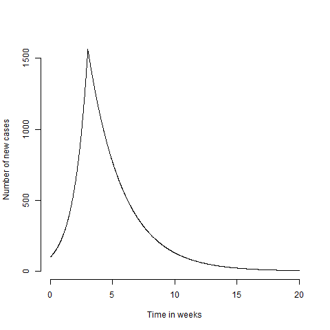
Which looks stupid and spikey. You could try and remove this by having a more realistic formulation for $R(t)$ and then solving $\log(N(t)/N_0) = \int_0^{t/\Delta} \log(R(t’)) dt’$ which would smooth out the bumps. But as I only care about the intuition of the model, I’ll save the effort and ignore the spikey maximum. We can see then see the effect of locking down a couple of weeks later
plot(t,N(t,tLock=5),'l',col='red',xlab='Time in weeks',ylab='Number of new cases',frame.plot=FALSE)
lines(t,N(t),col='black')
legend('topright',c('Lockdown week 3','Lockdown week 5'),lty=1,col=c('black','red'),bty='n')
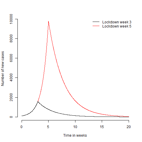
Obviously the later lock down leads to more cases. If you look at the graph long enough, you’ll also notice that it takes longer to get back down to the number of cases needed to be able to keep $R<1$ with non lock down methods like track and trace. This is because every weeks worth of cases you put on takes more than a week to take off again. If we assume we can exit lock down when cases get below $N_e$, then the time from the start of the outbreak to exiting lock down is
\[\frac{t_{Total}}{\Delta} = \frac{1}{\log(R_-)}\left( \log(\frac{N_e}{N_0}) - \frac{t_L}{\Delta}\log(\frac{R_+}{R_-})\right)\]which if we assume $N_e=N_0$ for simplicity, then the total time from outbreak to ending lock down $t_{Total}$ is
\[\frac{t_L}{\Delta\log(R_-)} \log(\frac{R_-}{R_+})\]Putting in the numbers from above, we find that every extra week of delayed lock down, costs you nearly 3.5 weeks on the way back down! Intuitively you might think that delaying the start of lock down by 2 weeks delays the time you can safely reopen by 4 weeks (2 up, 2 to go back down). In fact, it delays reaching that point by $2*3.5 = 7$ weeks!
Obviously that’s for the numbers I’ve plugged in, feel free to try your own. But the slow decline in case numbers in places like Spain and Italy show that these numbers are probably in the right ballpark. If you want to be really depressed, plot how things change as $R_-$ gets close to $1$
Rup=2.5
Rdown=seq(1/Rup,0.95,0.01)
plot(Rdown,log(Rdown/Rup)/log(Rdown),'l',ylim=c(2,20),xlab='R post lock-down',ylab='Weeks lost per weeks delayed')
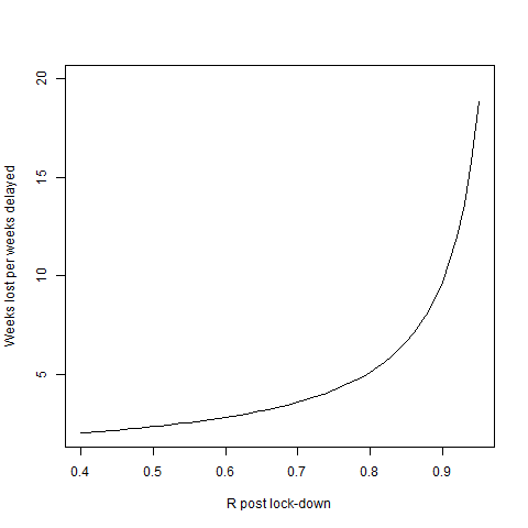
I’ve stopped the plot on the left at the point where the graph is symmetric and each week of delay only delays reopening by 2 weeks. But if $R$ is closer to the right of the plot (or people stop sticking to the guidance) we’re in for a long, long ride.
Testing and true positive rates
One of the most basic statistical “paradoxes” that every undergraduate will be familiar with (I hope), is that of not accounting for population incidence in medical testing. The usual example is that you have a test for a disease that has a 100% true positive rate (so everyone with the disease tests positive), and 1% false positive rate (meaning 99% of people who don’t have the disease test negative). If you test positive, what is the chance that you have the disease? The “intuitive” answer is to say the test is 99% accurate and so your chances of having the disease are 99%.
This is wrong, because we don’t have a crucial piece of information; how prevalent is the disease in the population? If the disease only occurs in 1% of the population, you are just as likely to be a false positive as to truly have the disease. That is, your probability of having the disease after testing positive is approximately 50% not 99%.
This is relevant in the context of COVID19, because one of the really difficult thing to nail down has been the infection mortality rate; what fraction of those who are infected die. This has been difficult to nail down because its very hard to know how many people in the population had the disease, but were asymptomatic and so were never counted. So people have designed various experiments and analyses to guess how many people in the population have had COVID19.
Variability depends on population percentage
There are several just obviously wrong studies, such as this antibody prevalence study. They are obviously wrong because while we don’t have good data for the precise infection mortality rate (which is not one number anyway and will depend on factors like age and health of individual), we have several good bits of evidence that put a reliable lower bound on the mortality rate. These are cases where even if you assume 100% of individuals had the disease (which they almost certainly didn’t), you still get a mortality rate around 0.2%. The three that I have come across are the diamond princess cruise ship, New York City and certain regions of Northern Italy. In all cases, even if everyone in the region were infected, you can’t get the mortality below about 0.2%, with the realistic number looking like it’s somewhere around 1%. So any study that concludes the mortality is significantly below 0.2% should just be immediately dismissed as absurd unless some really amazing evidence that the numbers from studies based on the diamond princess and others are wrong. Strong claims require strong evidence.
To me the far more likely explanation lies in the following equation (which expresses the “paradox” from above),
\[O = \rho \textrm{TPR} + (1-\rho) \textrm{FPR}\]that is the observed rate of positives $O$ equals the true rate of positives $\rho$ times the true positive rate, plus the true rate of negatives $1-\rho$ times the false positive rate. Which shows that even a small false positive rate will lead to a big difference in your inferred population prevalence when the true prevalence ($\rho$) is low.
Of course, the people doing these studies are aware of this and so try and estimate the true positive rate and false positive rate for their test. If you know these, you can just invert the equation and infer what the true prevalence is
\[\rho = \frac{O-\textrm{FPR}}{\textrm{TPR}-\textrm{FPR}}\]The problem with this is that the estimates of false positive rate are themselves uncertain and a small error in estimating your false positive rate can lead to a big error in your inferred population prevalence.
High variability much higher to get when large population fraction.
All of this has been covered in much more detail, by people much better at communicating the point than I am. What I think is interesting about this and that I haven’t seen mentioned as much is that having a strong dependence on the false positive rate only happens when $\rho$ is low. We can see this if we simulate ten random tests with false positive rates between 0 and 0.05 and plot the difference in observed and true prevalence relative to the true prevalence, $\frac{O-\rho}{\rho}$,
rho = seq(0.01,0.2,.01)
fpr = seq(0,.05,.01)
tpr = 1
sims = lapply(rho,function(e) {
  o = (e*tpr+(1-e)*fpr)
  (o-e)/e})
names(sims) = sprintf('%d%%',round(100*rho))
boxplot(sims,
  las=2,
  xlab='True population prevalence',
  ylab='Error in population prevelance estimate',
  frame.plot=FALSE)
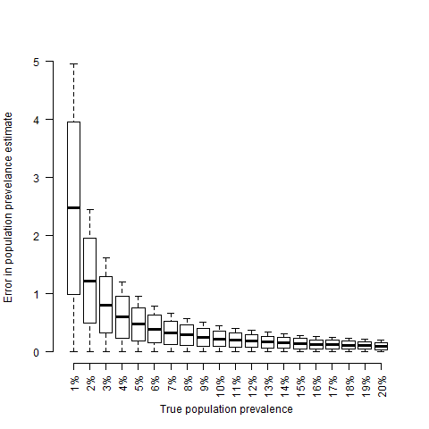
What I find interesting about this plot, is that errors in the false positive rate only really have an effect when the population prevalence is low. So I think we could actually turn the argument around and argue that the fact that we see large variability in the estimates of population frequency of COVID19 implies that the true population frequency is low. Of course there are other possible explanations. Different regions will have different prevalences and it’s always possible to get variability by making an outright mistake. But unfortunately I think that the truth is that the infection mortality of 1% is probably going to prove to be about right.
To normalise or not
Another thing I’ve struggled with is whether the number of reported COVID19 cases/deaths should be normalised to population or not. This has now become massively politicised due to people in the US trying to find ways of making it seem like it they haven’t handled it badly. But the politics aside, the right thing to do is not obvious, at least it wasn’t to me initially.
Partially this is probably due to my background, having worked in astrophysics, where we try and normalise everything to make it dimensionless, or in non-communicable diseases, where it’s the population size that matters. Because of this, my first reaction to any data set is “what should I normalise this against”?
At the very start of the outbreak (meaning where significant community transmission hasn’t happened yet), I think this makes sense. More people flowing into a country mean more chances to import the virus and the number of people entering a country will have at least some proportionality to its size. However, once the outbreak gets past a certain size, I don’t think it makes a difference how many new cases you get, all that matters is how fast it’s spreading in the community.
Let’s compare what I’ll call the “early phase” of fewer than 10,000 cases. Country 1 is very isolated and imports just the one case, while country 2 is big and connected and imports 100 cases per week on an ongoing basis. Let’s compare the two cases.
N = function(t,N0=1,Nextra=0,delta=1,R=2.5){
  maxT = max(t)
  addPoints = seq(delta,maxT,delta)
  base = N0*exp(t/delta*log(R))
  extra = colSums(do.call(rbind,lapply(addPoints,function(e) ifelse(t<e,0,Nextra*exp((t-e)/delta*log(R))))))
  base+extra}
t=seq(0,11,.01)
plot(t,N(t),'l',ylim=c(0,10000),xlab='Weeks from first infection')
lines(t,N(t,N0=100,Nextra=100),col='red')
legend('topleft',c('Small country','Large country'),lty=1,col=c('black','red'),bty='n')
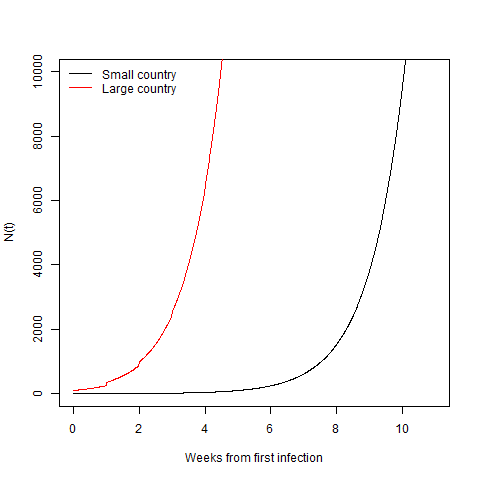
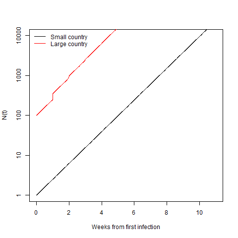
Clearly here the big country gets to 10,000 cases way faster than the smaller one. You can sort of see that in the little jumps in the red line as new cases are added every week. This is even more obvious on a log scale.
plot(t,N(t),'l',ylim=c(1,10000),xlab='Weeks from first infection',log='y')
lines(t,N(t,N0=100,Nextra=100),col='red')
legend('topleft',c('Small country','Large country'),lty=1,col=c('black','red'),bty='n')
What is interesting is if we compare the trajectory of the two countries from their 10,000th case. I haven’t changed anything from before. The small country only ever imported 1 case, while the big country is still dumping in 100 a new cases a week.
t=seq(0,3,.01)
plot(t,N(t,N0=10000),'l',xlab='Weeks from 10,000th case')
lines(t,N(t,N0=10000,Nextra=100),col='red')
legend('topleft',c('Small country','Large country'),lty=1,col=c('black','red'),bty='n')
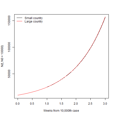
After the disease gets established, the size of the country is irrelevant and the only thing that matters is how quickly it spreads in the community. Lest you think I’m hiding the difference with the linear scale, here it is on the log scale.
plot(t,N(t,N0=10000),'l',xlab='Weeks from 10,000th case',log='y')
lines(t,N(t,N0=10000,Nextra=100),col='red')
legend('topleft',c('Small country','Large country'),lty=1,col=c('black','red'),bty='n')
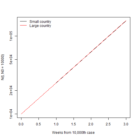
They’re still completely indistinguishable. So the size of country matters at the start, where it gets going more quickly in big, connected countries. But once it’s established, the country size becomes irrelevant and normalising by population just obscures which country (or region) is doing a better job of controlling the spread.
Of course, there is a final piece to this which is that exponential spread can’t go on forever. At some point “herd immunity” becomes important and starts slowing the spread of the disease. This point will be reached sooner in small countries than in large countries. However, in the countries that are doing well so far (Singapore, Vietnam, South Korea, Germany, New Zealand, etc.) this effect is completely irrelevant as they are nowhere near herd immunity and have only a tiny percentage of the population infected. It’s their good management of the disease through changes in behaviour that is limiting the spread, not the lack of people who could be infected.
So having thought this through, the right thing to do when comparing how well countries are managing COVID19 is to start $t=0$ at the point when they recorded their $10,000$th case (or $10$th death) and then plot the absolute number of deaths in each country. Exactly what the financial times coverage does. In the worst case scenario where a significant fraction of the world ends up infected, it might then become relevant to normalise by population again. But for now, doing so just obscures what is really going on.
Thinking quantitatively
Having already ranted for this long, you’d have thought I was out of things to say. My final thought relates to what I find frustrating about the public discourse around COVID19. Which is that the same thing that frustrates me about a lot of debates; that people don’t think about the effects of things in quantitative terms.
For example, one thing that gets thrown around a lot at the moment is that “we can’t trust China’s numbers”. Which is true, the numbers are probably incomplete at best and deliberately manipulated at worst. Is it plausible that the number of deaths is 2 or 3 times higher than reported? Sure. 5 times? Maybe. But 10 or 100 times? No way, it just wouldn’t be possible to hide that sort of difference. Similarly if there were a large scale ongoing outbreak like in New York with new hospitals being built and millions quarantined, that would be pretty impossible to hide. So the direction of travel is probably still reliable, even if the absolute numbers are not. Which is not really that dissimilar from many European countries where deaths outside hospitals are missed or added much later.
To pick a less politically charged example (although I’m not sure that exists), what is the effect of population density or demographics or some such factor? I’m sure each of these things has some effect on how quickly the virus spreads (i.e., on $R$). But the question we should be asking is not is there an effect, but how large is it and is it large enough to explain the differences in transmission between regions. This is a quantitative question that we can answer by looking at data. We should be formulating our understanding and response to these factors not by making binary classifications of things into “those that have an effect” and “those that don’t”. Instead we should strive to quantify the size of the effect and make decisions and arguments based on that.