A very common task when analysing complex data (e.g., genomic data) is to try and represent the data in two dimensions that capture the “essential features” of the data. Reducing a data set to 2 dimensions is trivial (e.g., ignore every dimension but the first two), the trick is to pick two dimensions that provide a useful summary of the data.
There are many so called “dimension reduction” techniques, but the go-to method for pretty much all biological data has been Principal Component Analysis or PCA. I say “has been” because recently tSNE1 has become the default alternative for representing single cell RNA-seq data.
I’m not sure I really grasp all the subtleties of PCA despite using it in one form or another for about a decade. At least with tSNE I have no confusion, I’m sure I don’t completely comprehend what tSNE is doing or the properties of the plots it produces. Perhaps by publicly airing my (mis)understanding of tSNE I can improve this state of affairs.
So tSNE, what the hell is it? Why can’t I just use PCA? And how do I interpret the Rorschach test looking plots it produces?
Embedded balls and manifolds
The way I’ve always thought about PCA is to imagine that the data I have are points in 3D (positions of stars relative to earth or something) and I’m looking to represent them using just two dimensions. The simplest thing I could do is to just look along the supplied x and y coordinates of the data I’ve been given. All PCA does is to tell me a more useful (hopefully) direction to look in. That is, it just rotates my default x,y,z coordinate axes. If I need to do something more complicated than change the direction I’m looking in to understand the data, PCA won’t be able to help me.
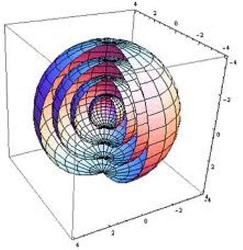
To see this limitation, imagine the spatial data I’m trying to understand are points on the surfaces of two nested spheres (2D manifolds in 3D space).
If I just plot these points using their x-y coordinates, I get something like this:
#Make nested balls
library(ggplot2)
N = 50
balls = expand.grid(theta=seq(0,pi,length.out=N)[-N],phi=seq(0,2*pi,length.out=2*N)[-(2*N)],R=c(1,100))
#Convert to cartesian coordinates
xyz = cbind(x=balls$R * sin(balls$theta)*cos(balls$phi),
            y=balls$R * sin(balls$theta)*sin(balls$phi),
            z=balls$R * cos(balls$theta))
#Plot in cartesian
df = as.data.frame(xyz)
df$ball = factor(balls$R)
gg_xy = ggplot(df,aes(x,y)) +
  geom_point(size=0.1)
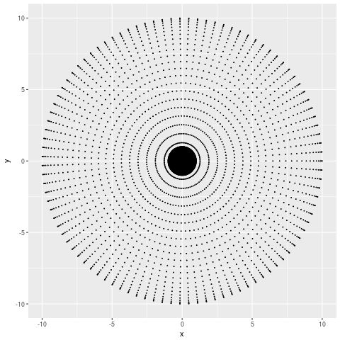
From which I can tell that my points are more dense at smaller x and y values, but not much more than that. If the number of points I sampled was large enough you wouldn’t even be able to tell that. Let’s try the PCA representation,
#PCA analysis
pca = prcomp(xyz)
#Plot PCA
df = as.data.frame(pca$x)
df$ball = factor(balls$R)
gg_pca = ggplot(df,aes(PC1,PC2)) +
  geom_point(size=0.1)
Which looks basically the same. Why? Because all PCA can do is spin our coordinate axes, and a sphere looks the same no matter where you look from the centre.
tSNE: What’s the point?
The point then of tSNE and of other non-linear dimension reduction techniques is to show structures in the data that cannot be found simply by changing the direction in which you look. For our data, that is the fact that our data points come from two different structures, the surfaces of spheres with radii 1 and 100.
What does the tSNE 2D representation look like for this data?
#Do tSNE
tsne = MYRtsne::Rtsne(unique(xyz),verbose=TRUE)
#Plot tSNE
df = data.frame(tSNE1=tsne$Y[,1],tSNE2=tsne$Y[,2])
df$ball = factor(sqrt(rowSums(unique(xyz)^2)))
gg_tsne = ggplot(df,aes(tSNE1,tSNE2,colour=ball))+
  geom_point(size=0.1)
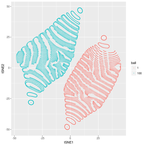
Which looks a bit funky, but has 2 distinct groups corresponding to the two spheres in our data. That is, tSNE has done a reasonable job of doing what it aims to do, discover the complex non-linear structures that are present in our data.
For this particular data set there is a much better and pretty obvious 2D representation of the data. Which is to plot the data using the spherical coordinates $R$ and $\phi$ (or $\theta$).
#The obvious plot
polar = as.data.frame(balls)
gg_spherical = ggplot(polar,aes(R,phi,colour=factor(R))) +
  geom_point(size=0.1)
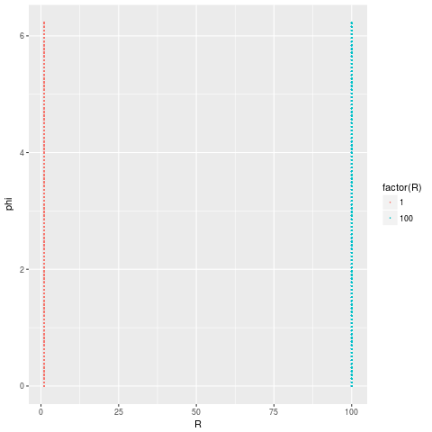
which perfectly captures the fact that our data comes from 2 distinct structures.
Of course in general we’re dealing not with 3D data but with 20,000D (in the case of single cell RNA-seq) data. But the idea remains the same, to capture structures in the data that can’t be found by rotating the coordinate axes.
Don’t interpret distances in tSNE plots
One of the things that keeps being repeated to me by people I trust to be well informed, but not to understand the details is, “don’t interpret distances in tSNE plots”. It’s advice I’ve passed on to others and is probably a decent starting point.
At some level, this is clearly garbage. The whole point is to put points that are connected in the higher dimensional space in some way close together in the resulting 2D representation. I can and should interpret the fact that the distances between MAST cells in a scRNA-seq data set are tiny to mean that they express similar genes. What I think is meant by the “don’t interpret distances” advice is that the clusters have meaning, but I shouldn’t interpret the higher order structure.
I don’t think this is correct either. We frequently see in our scRNA-seq data that clusters of Myeloid cells are closer to one another than they are to Lymphoid clusters. This makes biological sense and happens too consistently across too many data sets to be a coincidence. So what is the right way to think about distances?
Oh god, do we really have to look at the equations?
When I intuitively think about what a dimension reduction is trying to do, the rough idea I have in my head is that the distances between points in the 2D map should roughly reflect the distances between points in the original high dimensional space. This is sort of what tSNE is trying to do, but rather than operate on the distances it operates on transformed distances. tSNE defines two quantities,
\[p_{ij} \sim \exp(-\|\mathbf{x}_i -\mathbf{x}_j\|^2/2\sigma_i^2)\]and
\[q_{ij} \sim (1+\|\mathbf{y}_i -\mathbf{y}_j\|^2)^{-1}\]where $\mathbf{x}$ are positions in the original space, $\mathbf{y}$ are positions in the 2D tSNE map and $i$ and $j$ indicate different points. tSNE aims to pick values of $\mathbf{y}$ such that $p_{ij} \approx q_{ij}$. The values for $p_{ij}$ and $q_{ij}$ are derived from the distances in the high dimensional space and the tSNE map, but they are different from them in a number of important ways.
Firstly, $p_{ij}$ goes to zero really, really, really fast as the distances between points $\mathbf{x_i}$ and $\mathbf{x_j}$ increase. In fact, $p_{ij}$ goes to 0 so quickly that it is standard practice to explicitly set $p_{ij}=0$ for points separated by more than $2\sigma_i$ in some circumstances 2. What this means is that when constructing the tSNE map, the algorithm only cares about placing the nearest neighbours of each point correctly.
You might also think that tSNE should be required to place points that are distant in the original space far apart in the 2D map, but this is not the case. This is because tSNE makes $q_{ij}$ match $p_{ij}$ by minimising the Kullback-Leibler divergence, defined as,
\[\sum_{i\neq j} p_{ij} \log\frac{p_{ij}}{q_{ij}}\]which is equal to 0 for any $q_{ij}$ when $p_{ij}=0$.
That’s nice. But, I still don’t know how to interpret distances.
Essentially what all this means if points are nearby in the tSNE map, they were probably nearby in the higher dimensional space 3. But if points are not nearby than they are almost certainly not neighbours in the higher dimensional space.
What is “nearby”? The asymptotic limits of $q_{ij}$ are:
\[q_{ij} \sim 1 - \delta^2 + O(\delta^4) \approx 1\]for $\delta=||\mathbf{y}_i -\mathbf{y}_j|| \ll 1$ and
\[q_{ij} \sim \delta^{-2}\]for $\delta \gg 1$. So the “chance” of a point $j$ being as close to a point $i$ as one of $i$’s nearest neighbours is to $j$ (the limit of $\delta \ll 1$) is roughly proportional to the inverse square of the distance between $i$ and $j$ in the tSNE map. That is,
\[\frac{P(\text{$j$ is $i$'s neighbour})}{P(\text{$k$ is $i$'s neighbour})} \sim \|\mathbf{y}_i -\mathbf{y}_j\|^{-2}\]where $k$ is $i$’s nearest neighbour and $P()$ denotes probabilities. For example, points that are 10 tSNE units apart have about a 1% chance of being close neighbours.
What do I mean by “neighbours” of a point.
In the above I kept referring to neighbours of points. A neighbour of $i$ is any point that is within a few $\sigma_i$ of $i$. The value of $\sigma_i$ is calculated for each point in some complicated way that depends on the perplexity specified, but is set so the number of neighbours of each point is roughly equal to the perplexity specified.
Some examples.
All of this is very abstract and mathematical, and even then I’ve swept a number of the details under the carpet. Let’s return to our example of the embedded spheres which will hopefully make this more meaningful.
The values we’ve been talking about, $p_{ij}$, $q_{ij}$ and $\sigma_i$ are unfortunately not returned by the standard tSNE c++ library (at least not the one bundled with Rtsne). Having already gone this far done the rabbit hole, I modified the code (and the wrapper R package) to return these values4. You can get the modified code here if you want to play with it yourself.
Let’s look at the calculated values of $\sigma_{i}$
df$sigma = sqrt(1/2/tsne$beta)
gg_sigma = ggplot(df,aes(tSNE1,tSNE2,colour=sigma)) +
  geom_point(size=0.1)
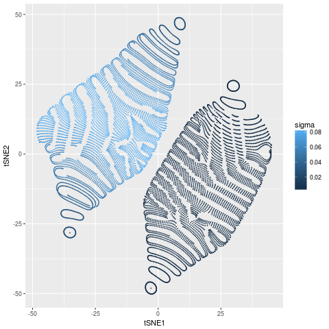
There are no surprises here. The points on the inner ball have much higher density (smaller $\sigma$) than the points on the outer ball. All points on both balls have roughly constant $\sigma$.
Now let’s look at the values of $p_{ij}$ for a few random points.
library(cowplot)
set.seed(7)
ggs=list()
for(tgt in sample(nrow(df),4)){
  df$p_ij = tsne$P[tgt,]
  sdf = df[tgt,]
  ggs[[as.character(tgt)]]= ggplot(df,aes(tSNE1,tSNE2,colour=log10(p_ij))) +
    geom_point(size=0.1) +
    geom_point(data=sdf,colour='red',size=0.1)
}
library(cowplot)
do.call(plot_grid,c(ggs,list(nrow=2,ncol=2)))
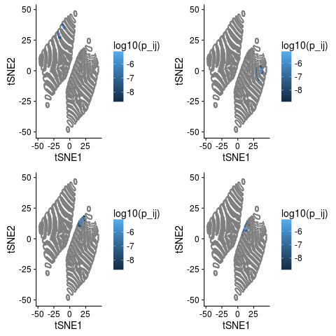
The point in question is marked red and values with $p_{ij}=0$ are grey. These plots illustrates a few things quite nicely.
- Most values of $p_{ij}$ are 0. For this data 98.96% of the entries in the $p_{ij}$ are 0.
- Neighbours of $i$ in the original space are neighbours in the tSNE.
- But so are points that are not neighbours in the higher space.
- Our intuition from above that all neighbours should be within about 10 tSNE units seems pretty good.
Let’s look at the last point more systematically,
dd = as.matrix(dist(tsne$Y))
tmp = sapply(seq(nrow(df)),function(e) quantile(dd[e,tsne$P[e,]>1e-9]))
boxplot(t(tmp),xlab='Quantiles',ylab='tSNE distance')
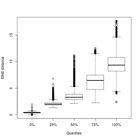
This plot shows the distribution of distances for all points with $p_{ij}\ne0$ for different quantiles. The median distance containing all neighbours is 10.2 and there is no point for which a neighbour is further than 18 tSNE units away.
Summary
I really meant for this to be a quick post about how tSNE differs from PCA. Certainly not something that needs 4 footnotes and a conclusion. I guess the key points are:
- tSNE finds complex shapes that can’t be seen by rotating coordinate axes.
- Distances are tricky to interpret in tSNE plots, but are not completely meaningless.
- A fair rule of thumb seems to be that if two points are more than 10 tSNE units apart they are not neighbours and you should not interpret their relative positions.
- If points are closer than that they’re probably neighbours in the higher dimensional space, but even then you can’t be completely sure.
- I need to learn to not get carried away.
Footnotes
-
tSNE stands for t-distributed stochastic neighbour embedding but if you found that very enlightening this post probably isn’t for you. ↩
-
Smooth particle hydrodynamics uses a gaussian kernel to estimate distances and other quantities. It is standard practice to replace the gaussian kernel with an approximation which is exactly 0 for separations greater than $2\sigma$ (see here). The tSNE implementation also seems to use a similar approach (using the Barnes and Hutt force evaluation scheme) which involves setting some values of $p_{ij}=0$, but I’m not as clear on the details of how this happens as I am for SPH. ↩
-
Why only probably? tSNE will be penalised if it sticks things that are really neighbours far apart, but won’t if it sticks things that are really far apart next to each other. So for a map where the cost function is zero, being a neighbour in the tSNE map is a necessary but not sufficient condition for being a neighbour in the higher dimensional space. ↩
-
The code actually returns what is referred to as $\beta$ in the tSNE code. $\beta$ is related to $\sigma$ by $\sigma=\sqrt{2\beta}^{-1}$. ↩